The Art of the Disneyland Attraction Posters
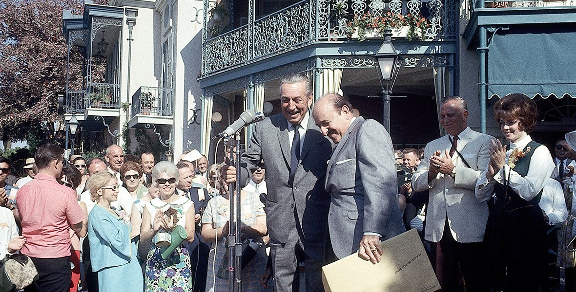
Part of Walt’s vision heading into his new project, Disneyland, in the 1950s, was to ensure that anyone who stepped foot into the park felt like they were always experiencing something. Whether it was something new, or a sensation that they always felt when they were in the parks. To create such a feeling, Imagineers worked on major projects like land themes and food options, to miniscule projects like finding the right shade of green to paint construction walls and generator boxes. Every single detail in all of the world’s Disney parks has thought put into it. One of the things Walt wanted to add to the park to add marketing value as well as to the overall experience that you were entering into a new world, was attraction posters. The posters would sit at the very entrance of the park, welcoming guests into this whimsical world where anything can happen.
The Art Style of the Disneyland Attraction Posters
Posters rose to advertising fame in 1880 when the process became more accessible to people wanting to tell a story through a simple method. Many of the world’s earliest posters were very simple, including some text, and using mostly reds, yellows, and blues. In 1891, the Moulin Rouge poster by Toulouse-Lautrec marked the beginning of posters becoming a form of art. As decades went by, each country utilized posters for various different avenues of art and advertising, and posters entered the world of politics during the World Wars. By the 1920s, posters were used in the film industry to promote upcoming films, as well as for exhibitions, events, circuses, and fairs.
The concept art of Disneyland was made in the early 1950s once the project was approved by the bank and the land had been bought. The construction began in 1954 and Disneyland was “ready” to be opened in July of 1955, with some rushed jobs but nothing that couldn’t be fixed later on.
The poster art was worked on around the time of construction, and Imagineers were tasked with the job of finding the right art style to bring to the entrance of the park. According to the book Poster Art of the Disney Parks by Danny Handke and Vanessa Hunt, some of the inspiration that designers looked to were national park posters, military recruitment posters, magic shows, and World’s Fair posters. Unfortunately due to the lack of technology at the time, it would take much more time and effort to create posters in comparison to many decades later, so the poster design had to be simple, yet meaningful. They had to convey a message about the attractions in order to get guests to understand what Walt was trying to portray.
Artist Bjorn Aronson was chosen by the company to design some of Disney’s very first attraction posters, because of his experience with creating travel posters in the postwar era. Travel posters played with light, shadows, and flat colours. You can see these techniques used throughout the original posters to ensure they all tied together, but were unique in their own ways.
The Original Disneyland Attraction Posters at Opening Day
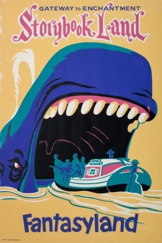
The attractions that were deemed worthy of receiving their own posters in 1955 were: the Santa Fe & Disneyland Railroad, Jungle Cruise, the Red Wagon Inn, Tom Sawyer Island, the Golden Horseshoe Revue, Casa de Fritos, Peter Pan’s Flight, Dumbo, Mad Tea Party, and Carousel, Storybook Land Canal Boats, Mickey Mouse Club Theater, 20,000 Leagues Under the Sea, Space Station X-1, Rocket to the Moon, and Autopia.


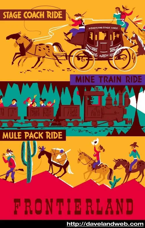
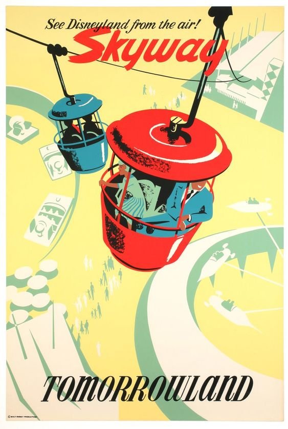
In 1956, even more posters were added, including ones for: the Disneyland Hotel, the Stage Coach, Mine Train, and Mule Pack, Rainbow Caverns, Skyway, Art Corner, and Astro-Jets.


The Designers of the Attraction Posters
Bjorn Aronson designed all of the posters above, as his art style shone through each. Another artist that Disney hired to do some early concept artwork for the posters was Sam McKim. He created concept art for the Red Wagon Inn and Pavilion, the Refreshment Corner and Candy Palace, Plaza Pavilion, Enchanted Tiki Room, and Tahitian Terrace, and Submarine Voyage. Later on he did concept art for the Walt Disney World posters, including the Jungle Cruise and Tropical Serenade in 1971.
Sam was born in Vancouver, British Columbia, but grew up in Los Angeles, California under the film spotlights. He was hired as an extra and later as an actor in various films through childhood and his teenage years. Into his adult years, he served the wars, but returned in 1953 back to the film business, but this time creating story art for movies. Sam was eventually hired by The Walt Disney Company to contribute his art to the parks in the form of design and posters, as well as creating storyboard for films like The Gnome Mobile (1967) and Big Red (1962).
Sam became a Disney Legend in 1996 for Imagineering.
The Evolution of Disneyland Attraction Posters
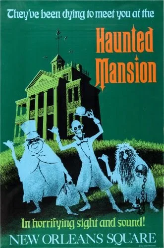
Much like everything else tied to Disney, the posters didn’t always remain the same, and continued to evolve as the park grew bigger. The purpose of the posters was the same though, to tell a story without words but with the magic of art. More posters were designed and printed in the 1960s, from artists such as Disney animator Claude Coats for Primeval World (1966), Paul Hartley for the Swiss Family Treehouse (1962) and The Enchanted Tiki Room (1963), and Ken Chapman and Marc Davis for the popular Haunted Mansion poster in 1969.


In the 1970s, Walt Disney World was ready to be opened and had the attraction posters ready to welcome guests in much like Disneyland did 20 years earlier. Some of the posters that were featured there were for the Walt Disney World Railroad and Jungle Cruise by Jim Michaelson, Ernie Prinzhorn, and Rudy Lord, The Crystal Palace by George Jensen, The Hall of Presidents by John DeCuir Sr., and the Country Bear Jamboree by Jim Michaelson, Marc Davis, and Eddie Martinez.


In the 1980s, with the advancement in technology, posters were able to be even more detailed than ever before, and this particularly benefitted the “space” or “future” themed posters. The poster for Spaceship Earth at Epcot was made in 1980 by Norm Inouye, concept art for the Indiana Jones Adventure poster was made by Nina Rae Vaughn in 1989, and the Pirates of the Caribbean poster was made by Jim Michaelson in 1982.


By the late 1980s and 1990s, posters were becoming too expensive to keep up with, especially the printing process. The tradition of the posters mostly paused until other cheaper options for printing were made available. There were a few new posters and adaptations of old ones that were continued to be made, but on a much smaller scale. These posters have now become a part of Disney’s history, and are great collectibles!
Reference list:
https://www.internationalposter.com/a-brief-history-of-the-poster/
http://disunplugged.com/2012/09/25/in-depth-with-the-authors-of-poster-art-of-the-disney-parks/
https://d23.com/walt-disney-legend/sam-mckim/
Handke, Danny, and Vanessa Hunt. Poster Art of the Disney Parks. Disney Editions, 2012.